
WhoCanUse
Explore how color contrast affects people with different visual impairments using WhoCanUse.
About WhoCanUse
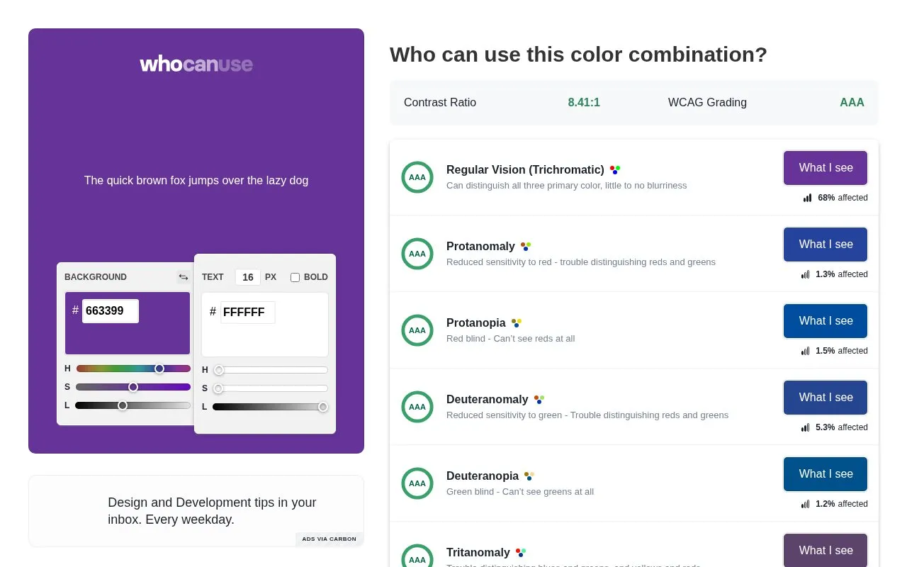
WhoCanUse checks text and background color combinations for contrast across different visual conditions. Users set background and text colors, adjust text size and bold weight, and view the contrast ratio, WCAG grade, and simulated views for color vision deficiencies, cataracts, glaucoma, low vision, and situational effects such as direct sunlight and night shift mode.
Impairment percentages shown are estimates for individual conditions and do not cover all visual impairments or add up to 100%. A failing grade means the combination may cause visual strain and should be avoided if possible.
Key features
- Enter background and text colors using HEX and HSL controls
- Adjust text size and bold weight for contrast grading
- Displays contrast ratio with WCAG grades
- Previews combinations as seen with different color vision deficiencies
- Includes simulations for cataracts, glaucoma, and low vision
- Simulates direct sunlight and night shift screen effects
Best for: Designers and developers choosing text colors who need to check contrast for visual impairments.
Good for
- Shows one color pair across multiple vision conditions at once
- Factors text size and weight into the contrast grade
- Identifies sources for impairment percentage estimates
Watch out for
- Population figures are estimates and do not cover all visual impairments
- Addresses only color contrast for blindness and low vision, not full WCAG scope
WhoCanUse at a glance
- Website
- whocanuse.com
- Category
- Design & Creative › Color Tools
- Type
- Online tool
- Pricing
- Not confirmed. Check the site
- Platforms
- Web
- Open source
- Not stated
- Last checked
- Oct 5, 2026 · Online when checked
- Listed
- Oct 5, 2026
Guides for Color Tools
WhoCanUse alternatives
Tools and sites you could use instead, ranked by how closely they match.

Explore accessible foreground and background colors with Color.review, which displays contrast measurements.

Accessible Palette creates color systems using CIELAB and LCh models, with controls for lightness and WCAG contrast ratios.
Pick
24 alternativesAdobe Color provides color palettes, themes, a color wheel, contrast checking, and tools to extract colors from images.
Pick
24 alternatives
Generate color values for design systems by setting a target contrast ratio.
Open source
24 alternatives
Generate or browse color palettes and use image picking and contrast checking tools.

Explore 180 color palettes inspired by historical periods and visual styles with Color Leap.
Popular in Color Tools
Well-known listings from the same topic.
hue.toolshue.toolsColor Pickerimagecolorpicker.comSchemeColorschemecolor.comRealtime Colorsrealtimecolors.comColor Huntcolorhunt.co


WhoCanUse FAQ
What does a failing grade mean?
The grade combines color contrast, text size, and text weight. A fail means the combination may cause visual strain and should be avoided if possible.
Where do the impairment percentages come from?
The percentages are sourced from colour-blindness.com and Vision Australia.
Why don't the percentages add up to 100%?
They are estimates for individual impairments and do not cover the full range of visual impairments.
Is something wrong or out of date?
Tell us and an editor will check it.
Own this website?
Claim this listing
Claim the listing and suggest updates yourself. An editor checks every claim first.